
Creating a Restorative Retreat with Calming Color Schemes
Life is busy.
Between work, long commutes, and taking children to practice, you want a home where you can relax when the day finally slows down.
The colors around you play a role in that feeling. Bold contrasts, shiny finishes, or too many competing tones can make a room feel restless, even when everything is thoughtfully styled.
Flooring provides the visual foundation for that sense of calm. Its color and finish influence how wall paint appears, how natural light moves through the space, and how furnishings feel grounded. Soft neutrals open narrow spaces, while warm tones make open layouts feel more welcoming.
When your color choices are intentional, the result is a home that feels composed, comfortable, and easy to live in, shaped by a palette that supports slower mornings, relaxed evenings, and everyday routines that feel more balanced.
How Color Shapes the Mood of Your Home
Color influences how a space feels the moment you walk into it.
Light shades tend to make rooms feel open and calm, while deeper tones create a sense of intimacy and comfort. Warm hues often come across as welcoming and settled, while cooler shades read quieter and more restrained.
Even small shifts in tone can change whether a room feels energizing, balanced, or ready for rest. That is why softer palettes often feel right in spaces meant for unwinding. Pale neutrals, muted greens, dusty blues, and clay-inspired shades avoid sharp contrast and visual tension. Instead, they allow your eye to move easily around the room, which helps spaces feel steady and composed.
When colors relate to one another across walls, furnishings, and architectural details, rooms feel intentional rather than busy. That visual calm sets the stage for the flooring choices that bring the entire palette together.
How Flooring Color Influences the Atmosphere of a Room
Once your wall colors establish a mood, the floor determines how that palette actually lives in the space. Because it stretches across the entire room, flooring color quietly guides how light is reflected, how bold or soft paint appears, and whether a space feels open, grounded, or intimate.
A pale wall can feel brighter or more muted depending on what sits beneath it. Deeper paint shades can read rich and enveloping or heavy and closed-in based on the tone and depth of the floor. When those elements are aligned, the room feels calm and cohesive rather than visually busy.
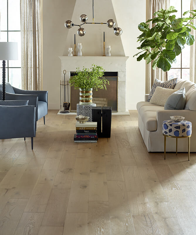
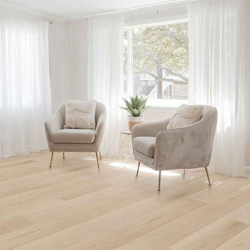
Light and Airy Flooring Options
Light and airy floors typically sit in the pale to mid light range, often with soft grays, gentle beiges, washed wood tones, or creamy whites. These colors reflect natural light, making rooms feel open and breathable. They work well in smaller spaces, low-light rooms, or where you want a calm, uncluttered look.
When paired with soft wall colors, light floors allow the eye to move easily through the room, which creates a sense of ease rather than contrast.
- Hardwood: White oak, ash, maple, or lightly stained planks with subtle grain and matte finishes avoid glare while keeping the surface bright.
- Luxury Vinyl: Pale oak visuals, soft blonde tones, or light stone looks provide brightness while standing up to busy households and everyday wear.
- Laminate: Washed wood designs and neutral blondes help maintain an open feel while offering durability in active rooms.
- Tile: Porcelain in creamy whites, pale concrete looks, or light marble visuals works well on floors or walls to extend the sense of openness through kitchens, baths, and connected living spaces.
Warm Flooring Tones That Create Comfort
Warm tones include honeyed woods, golden beiges, soft browns, and creamy neutrals with yellow or red undertones. These colors tend to make a room feel settled and inviting, which is why they are often chosen for living rooms, bedrooms, and gathering spaces where comfort matters most.
Warm flooring pairs naturally with layered neutrals, muted wall colors, and soft lighting, helping spaces feel welcoming throughout the day.
- Carpet: Sandy beiges, camel tones, or soft taupes add visual warmth while creating a cozy surface underfoot.
- Hardwood: Natural hickory, maple with amber stains, or oak finished in warm tones brings richness without overpowering the room.
- Luxury Vinyl: Planks with golden undertones or subtle walnut visuals deliver warmth while maintaining easy care in busy areas.
- Laminate: Medium warm browns and classic wood looks help balance cooler wall colors and add depth to open layouts.
- Tile: Terracotta-inspired porcelain, creamy travertine looks, or warm-toned ceramic works beautifully on floors or accent walls to soften kitchens and baths.
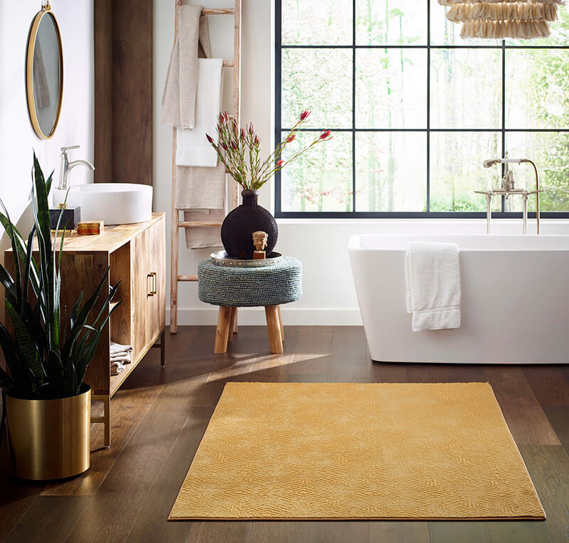
Earth-Inspired Flooring Colors That Feel Grounded
Earth-inspired palettes draw from nature with clay, sand, stone, moss, bark, and muted mineral tones. These shades often fall in the mid-range, creating a stable visual base that makes rooms feel calm and anchored rather than stark or dramatic.
They work especially well in spaces where you want a connection to the outdoors or a sense of quiet strength, pairing easily with natural fabrics, wood accents, and layered neutrals on the walls.
- Carpet: Heathered taupes, soft olives, or clay-colored blends hide wear while adding subtle depth.
- Hardwood: Mid-toned oaks, walnut hues, or wire-brushed finishes highlight natural grain and reinforce an organic feel.
- Luxury Vinyl: Stone-inspired visuals, weathered woods, and muted browns bring nature indoors while holding up to daily activity.
- Laminate: Textured surfaces in driftwood grays, mushroom browns, or soft mineral shades add character without feeling heavy.
- Tile and Natural Stone: Slate looks, limestone visuals, travertine-inspired porcelain, and real stone surfaces create an authentic foundation.
How Flooring Texture Changes the Way a Room Feels
You may not immediately think of texture as being central to using color to create a calming environment, but it is.
Gentle variations in the floor diffuse light and soften how colors appear, while matte finishes, natural grain, and subtle patterns keep the palette consistent and allow your wall colors and furnishings to remain the focus.
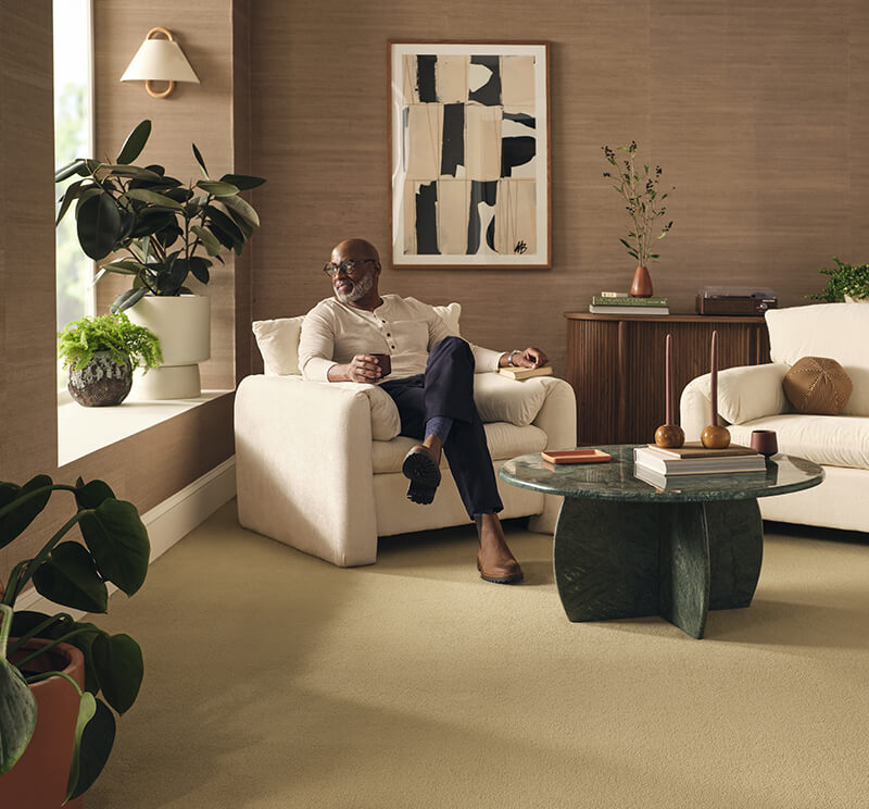
Carpet Textures That Add Softness and Calm
Carpet influences a room’s palette through the way its fibers absorb and scatter light. Medium-height piles often give colors a richer, more even appearance, while extremely short or highly reflective fibers can make tones feel flatter. Loop and cut-pile constructions change how shadow and depth appear, which subtly affects how wall colors are perceived.
Low-contrast patterns and heathered blends tend to work best in restful spaces. They add dimension without interrupting the palette.
Wood and Wood Look Finishes That Feel Relaxed
Hardwood and wood-look floors affect color through sheen and surface treatment. Matte finishes reduce glare, helping wall shades stay consistent throughout the day. Wire-brushed textures soften reflections and introduce fine movement that keeps neutral palettes from feeling flat.
Natural variation in grain and tone also plays an important role. Planks with gentle shifts in color are organic and layered, reinforcing a calm environment without pulling attention away from the overall scheme.
Making Tile and Stone Feel Comfortable Underfoot
Tile and stone bring distinctive surface character, which makes finish selection especially important in soothing interiors. Honed or matte surfaces limit reflection and help colors throughout the room feel more grounded.
Porcelain offers controlled patterning and consistent tone, while natural stone introduces organic variation that pairs well with earth-based palettes. In spaces where traditional tile might feel cool, stone-look luxury vinyl can echo the same color story with softer edges and a more muted surface appearance.
Design Details That Reinforce a Calming Space
Flooring and wall color set the foundation, but the details you add also shape how restful the space feels. Textiles, finishes, and accent colors influence how light is softened and how busy a room appears. When these elements echo the tones and textures already in the space, the result feels cohesive.
- Rugs: Area rugs add warmth, absorb sound, and help soften large expanses of hard surface flooring. Choose low-contrast patterns and colors pulled from your walls or furniture to keep the look relaxed.
- Window treatments: Fabric shades, linen panels, or woven materials filter light and reduce harsh glare, which helps colors feel calmer and more consistent all day.
- Upholstery: Sofas and chairs in textured weaves, soft leathers, or performance fabrics with a matte finish balance smooth floors.
Designing a Home That Helps You Slow Down
Creating a calmer home starts with thoughtful choices that work together from the ground up. Color sets the emotional tone of a space, while flooring anchors that palette and influences how every shade is experienced. When finishes, textures, and supporting details are chosen with intention, rooms feel easier to live in and more inviting at the end of a long day.
Whether you gravitate toward light and airy neutrals, warm tones, or earthy hues pulled from nature, the right floor provides consistency and visual balance throughout your home. It supports the mood you want to create today while giving you flexibility as your style evolves over time.
At Gainesville CarpetsPlus COLORTILE, we’ll help you explore flooring options that pair beautifully with your color choices and your lifestyle in Gainesville, FL.